DigiPen is different and always has been. We were the first school in the world to offer a bachelor’s degree in video game development, and we continue to blaze trails today with our multidisciplinary, project-based learning. When thinking about how to tell the story of DigiPen’s unique approach to computer science education in particular, we wanted to explain things for readers in a format that was as innovative as the ideas we’d be communicating.
As you’ll see in the resulting presentation, “Why DigiPen’s Computer Science Education Is Different,” we landed on the idea of an animated comic, one with technical features we believe may have never been executed quite this way before. Here’s what sets our comic apart.
MP4s vs. GIFs
Animated comics aren’t new — they’ve existed on the web in various forms by using GIFs to create panels with looping action. The problem with GIFs is that the 30-year-old file format shows its age, both through its 256 color limit and poor file compression, which can quickly eat up precious data and slow your browser down. To solve this dilemma, we utilized an HTML 5 trick that allowed us to use MP4 videos — which compress much better and allow for far more colors — while still retaining the repetitive looping behavior of GIFs. The switch allowed us to animate longer, more elaborate loops than data-hungry GIFs would have permitted, all at a fraction of the file size.
Responsive Display
Most modern webcomics are formatted as a single square image at a fixed size. Sometimes, in the case of a classic four-panel strip, all the panels are contained in one fixed square image, which displays nicely on a social media feed. Other times, especially on Instagram and Twitter, three- and four-panel strips are broken up into individual images that the user scrolls through horizontally, reading the comic panel-by-panel like a slideshow.
DigiPen’s website adjusts dynamically to fit the user’s screen. The layout shifts from one to two columns depending on your screen size. It also scales both font and image sizes up and down for better readability. Given that the common static square format wouldn’t work for our website, we found a different solution. We broke each panel out individually and used a grid system to control the layout. On larger screens, the panels arrange themselves in a more interesting layout akin to what you’d find in traditional comic books, all while scaling the text, panel, and caption sizes dynamically to maintain legibility when the browser size is adjusted. When users are viewing the site on a smaller screen, the content shifts down to a single column, allowing the user to scroll down through the comic and still read the text without zooming in.
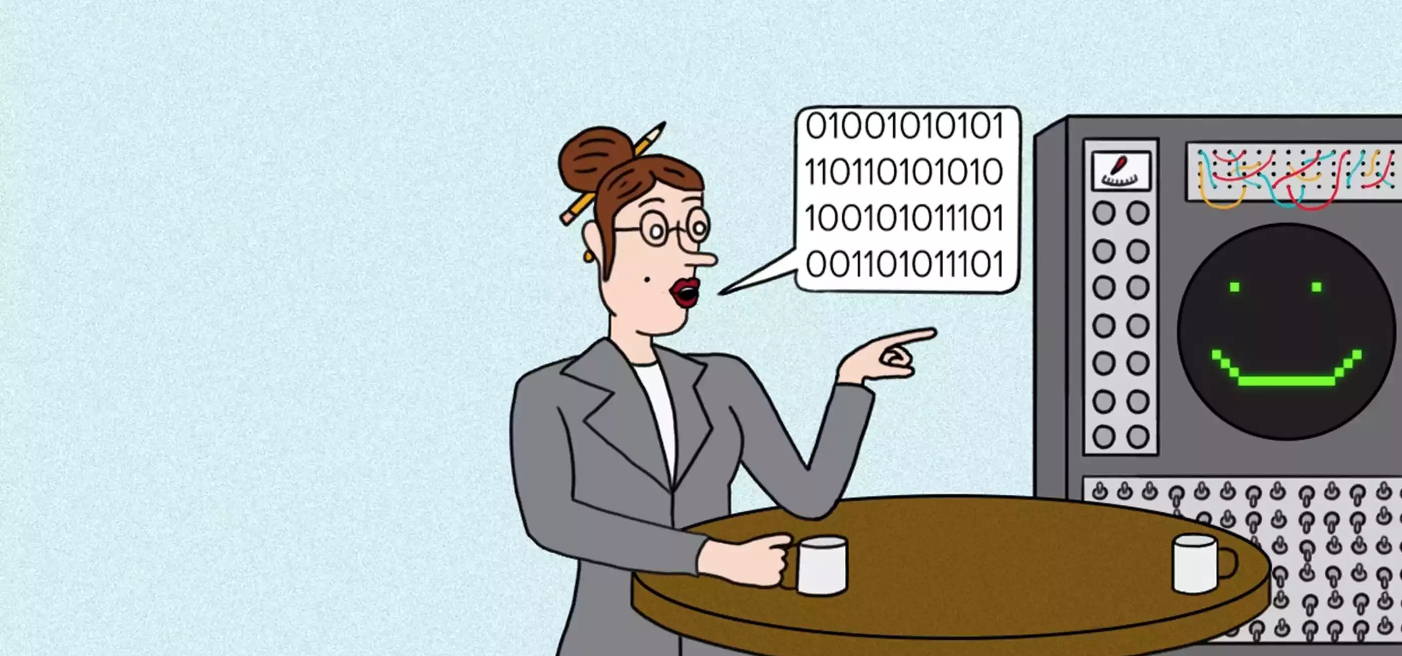
Accessible Text
Making our animated comic accessible to all was one of our biggest concerns. Users with impaired visibility might be able to zoom in on a typical static webcomic panel and understand the contents by looking at the image itself, but they might have difficulty reading the blurry zoomed-in text, preventing them from fully following along. Our solution to this problem was to separate captions and speech bubbles out of the images altogether, using code to overlay them on top of the MP4s as plain text instead. This way, screen reader users are able to read the comic the same way that they would consume text on a normal web page. As an added bonus, this solution also made the comic more readable for robots as well. While robots definitely aren’t our primary audience, we try to make sure users are able to find our content through search engines and our own site search. Because the text on the page is text, and not baked into an image like a normal webcomic, robots will find it easy to consume and catalog for search engines.